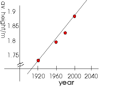
 The independent variable here is the YEAR and it is plotted on the horizontal axis.
The independent variable here is the YEAR and it is plotted on the horizontal axis.
The dependent variable is the AVERAGE HEIGHT and this is plotted on the vertical axis. The height is a dependant variable because we are trying to determine a relationship between the year and the height. In particular, we are trying to see how the height depends upon what year it is.
If you are not sure about what those last two sentences say, there is a short explanation of variables available.
A good plot has the following features:
| 1. | The horizontal and vertical axes are labelled with the name of the variable and the units (if appropriate). |
| 2. | Scales for the axes are chosen so the plot fills the page and any trend in the data is clearly visible. |
Remember that the data points are experimentally measured quantities which are associated with some degree of experimental uncertainty. Therefore, do not mark them with a tiny dot. Rather, use a large well-defined symbol, such as a circle surrounding the actual measurement. In the case of the average height, error bars are used to represent an interval of one standard deviation from the mean.
The standard deviation is a quantity representing how far a typical data point will be away from the average value of all the data points. A small standard deviation means that there was little variation in the original data (probably a good thing), while a large value for the standard deviation means that the average value may not mean very much.
 On to the interpretation of the graph.
 Table of Contents